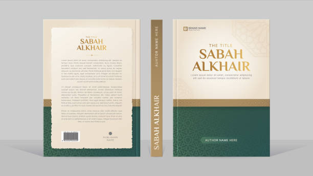
When designing a book, every detail matters, starting from the layout to the choice of fonts. Among these details, selecting the font for the back cover of a book is particularly crucial. This font not only conveys essential information like the blurb, testimonials, or ISBN but also complements the overall design that draw readers attention.
In this post, we discuss key things that you need to know about choosing the right font for a book’s back cover.
This article is written to adress the needs of every stakeholder in the publishing industry, including self-published authors, designers, or publishers.
Why Fonts Matter for Back Covers
The back cover of a book is the final push that convinces potential readers to make a purchase. Fonts play a pivotal role in:
- Readability: Readers should be able to quickly scan and understand the content.
- Aesthetic Harmony: The back cover font should align with the front cover and overall theme of the book.
- Branding: Fonts help reinforce the genre and tone of your book, from serious non-fiction to playful comics.
The choice of font for your book is not just about the beauty of your book—it’s also a strategic decision that can influence sales. Fonts guide the reader’s perspective about a book and aid them in making an informed decision. If you’re new to formatting eBooks or physical copies, read How to Format an eBook for step-by-step guidance.
What Fonts Are Typically Used on Book Covers?
Choosing the right font involves understanding its purpose. Here are some popular font types commonly used:
#1. Serif Fonts
Serif fonts like Times New Roman, Baskerville, or Garamond are classic choices for books. These fonts convey professionalism and are often associated with traditional genres like history, memoirs, or literary fiction. Serif fonts provide a sense of authority and credibility, making them a go-to choice for many authors and designers.
#2. Sans-Serif Fonts
Sans-serif fonts like Helvetica or Futura have a clean and modern appearance. They’re popular for contemporary books, especially self-help or business genres. Their simplicity and clarity make them suitable for books aimed at a younger or tech-savvy audience. For more about choosing fonts, check out How to Choose the Right Book Font.
#3. Decorative Fonts
For genres like fantasy or romance, decorative fonts can add a unique touch. However, these should be used sparingly to avoid overwhelming the design. Fonts like Edwardian Script or Gabriola can evoke a sense of elegance and mystery, but they must remain readable.
#4. Comic Fonts
Fonts like Comic Sans or Blambot are ideal for graphic novels or children’s books. They exude playfulness and are designed to capture attention. Comic book fonts often feature exaggerated curves and bold strokes, adding vibrancy to the design.
For authors designing their back covers, platforms like Envato offer a wide selection of book cover fonts tailored to different genres. Explore their 11,280 Book Fonts – Envato collection for inspiration.
What Is the Best Font Size for a Book Back Cover?
Font size plays an essential role in ensuring readability and aesthetics. Here are some general guidelines:
- Blurb Text: Use a font size between 10pt and 12pt. This ensures readability without overcrowding the back cover.
- Author Name: Slightly larger, between 14pt and 16pt, to make the name stand out. Learn more about styling the author’s name on your cover in How to Create a Book Press Kit.
- Headings: Use bold or larger fonts for subheadings to guide readers’ attention.
- ISBN and Price: Keep this minimal, around 8pt to 10pt, as it’s not the primary focus.
If your book is a standard 6×9 inch size, these recommendations work well for maintaining balance and proportion. You can also experiment with kerning and line spacing to optimize the layout.
Suggested Fonts for Back Covers
Here are some popular fonts that suit a variety of genres:
1. For Fiction
- Baskerville
- Palatino
- Georgia
These fonts are timeless and provide a literary feel, perfect for novels or short stories.
2. For Non-Fiction
- Helvetica Neue
- Lato
- Roboto
These fonts are modern and professional, ideal for educational or business books.
3. For Graphic Novels or Comic Books
- Comic Sans
- Blambot Pro
- Action Hero
These fonts bring energy and creativity, making them suitable for visually rich content.
4. For Romance or Fantasy
- Edwardian Script
- Gabriola
- Cinzel
This is a good fit matching the themes of romance or epic tales. If you’re using Mac, learn How to Install Fonts on Mac in 2024 to expand your design options.
How to Choose Fonts for the Back Cover
1. Consider Genre and Tone
The font must reflect the genre of the book. For instance, a whimsical script font works for romance but would be out of place on a business book.
2. Match Front and Back Cover Fonts
Consistency is key. The font on the back should complement the title font used on the front. This creates a cohesive design that ties the book together.
3. Test Readability
Always print test samples of your back cover. Ensure the text is easy to read from a reasonable distance. Testing on different devices can also help for eBooks.
4. Use Tools to Format Your Book
Tools like Adobe InDesign or Canva offer templates and font suggestions to streamline the design process. Explore the Best Book Formatting Tools for additional resources.
Frequently Asked Questions
What Font Are Books Written In?
Most books use classic serif fonts like Times New Roman, Garamond, or Georgia for the main text. These fonts ensure readability and a timeless aesthetic.
What Size Font Do You Use for Books?
For body text, a font size of 10pt to 12pt is standard. Chapter titles and headings can range from 14pt to 18pt.
What Is the Best Font for Comic Books?
Blambot Pro, Comic Sans, or Anime Ace are excellent choices for comic books as they are playful and easy to read.
Conclusion
Choosing the perfect font for the back cover of a book is a blend of art and science. From serif classics to modern sans-serif styles, the right font can elevate your book’s appeal and help it stand out in a crowded marketplace. Don’t forget to consider readability, font size, and genre alignment when making your choice. With this guide, you’re well on your way to creating a professional and eye-catching back cover that resonates with your audience.
Leave a Reply
You must be logged in to post a comment.